5 · Basic plots II

Tuesday, September 8, 2026

Slides · Live script · Source

The half of base graphics that turns an instrument into a figure: shading, colour scales, hand-built axes, unequal panels, heat maps, maps, animation.

The colour, map and animation sections use RColorBrewer, maps, mapproj and magick; install them once with install.packages().

Objectives

By the end of this session you can:

  • Lay out panels of unequal size with layout().
  • Shade a window with rect(); draw a confidence band with polygon().
  • Turn a numeric column into a colour scale with brewer.pal() and findInterval().
  • Draw your own axes with axis(), box() and mtext().
  • Draw a matrix as a heat map with image(), and points on a map with map().
  • Write png() frames in a loop and stitch them into an animation.

Building the table

Everything below runs off one data frame, built here so this page and its script stand on their own.

pm <- read.csv("data/epa_pm25_la_county_2025.csv",
               colClasses = c("Site.ID" = "character"))
names(pm)[names(pm) == "Daily.Mean.PM2.5.Concentration"] <- "pm25"
names(pm)[names(pm) == "Local.Site.Name"]                <- "site"
pm$date <- as.Date(pm$Date, format = "%m/%d/%Y")

transect <- c("Pasadena", "Compton",
              "Long Beach-Route 710 Near Road", "Lancaster - Fairgrounds")
d      <- pm[pm$site %in% transect &
             pm$POC == 1 & pm$AQS.Parameter.Code == 88101, ]
comp_y <- d[d$site == "Compton", ]
jan    <- d[d$date < as.Date("2025-02-01"), ]
comp   <- jan[jan$site == "Compton", ]
xr     <- as.Date(c("2025-01-01", "2025-01-31"))

dim(d)
#> [1] 1119   23

layout(): panels that are not the same size

mfrow gives you equal boxes. When you want one wide panel over two small ones, hand layout() a matrix of panel numbers:

matrix(c(1, 1, 2, 3), nrow = 2, byrow = TRUE)
#>      [,1] [,2]
#> [1,]    1    1
#> [2,]    2    3

The number is the order the panel is filled. Repeat a number and that panel spans those cells; use 0 to leave a cell empty.

layout(): the five things to know

  • matrix() fills down the first column unless you say otherwise. byrow = TRUE says otherwise.
  • layout() does what mfrow does, except the panels need not be the same size.
  • heights = and widths = are ratios, not units: heights = c(2, 1) makes the top row twice as tall.
  • layout.show(n) draws the empty numbered regions so you can check a layout before spending any plots on it.
  • layout(1) is the reset. par(op) does not undo a layout().

layout.show(): checking a layout

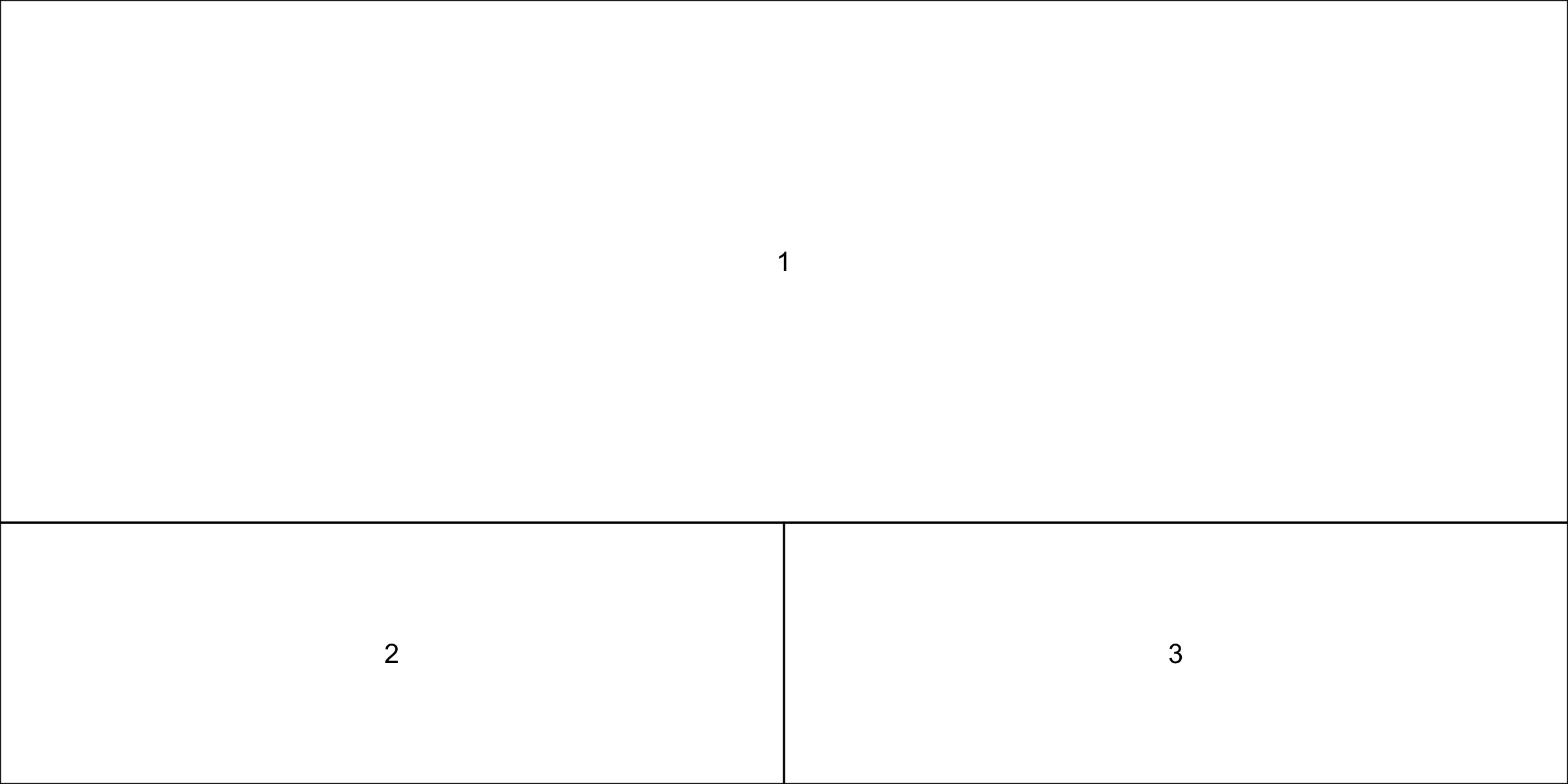
layout(matrix(c(1, 1, 2, 3), nrow = 2, byrow = TRUE), heights = c(2, 1))
layout.show(3)
layout(1)

Three empty numbered regions: one wide panel across the top labelled 1, and two equal panels beneath labelled 2 and 3, the top row twice as tall as the bottom.

A layout in use

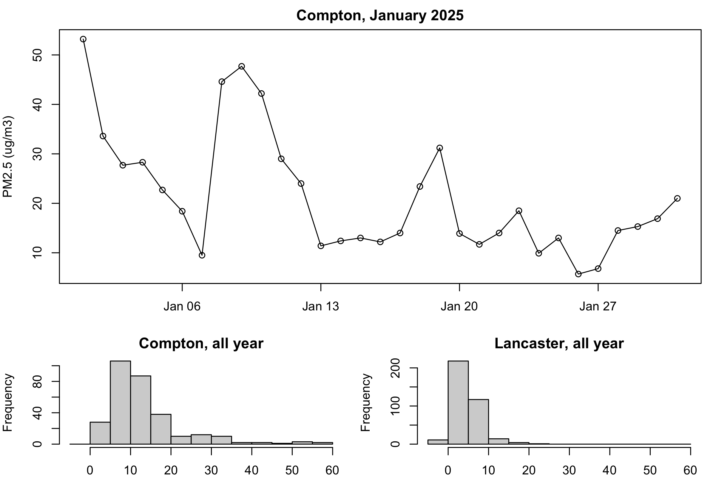
op <- par(mar = c(3, 4, 2, 1))
layout(matrix(c(1, 1, 2, 3), nrow = 2, byrow = TRUE), heights = c(2, 1))

plot(comp$date, comp$pm25, type = "o", xlim = xr,
     xlab = "", ylab = "PM2.5 (ug/m3)", main = "Compton, January 2025")
hist(d$pm25[d$site == "Compton"], breaks = seq(-5, 60, by = 5),
     main = "Compton, all year", xlab = "")
hist(d$pm25[d$site == "Lancaster - Fairgrounds"], breaks = seq(-5, 60, by = 5),
     main = "Lancaster, all year", xlab = "")

layout(1)
par(op)

One wide panel across the top showing Compton's January as a line with circles at each day, over two smaller panels holding histograms of Compton's and Lancaster's full-year readings on identical bins. Compton's tail runs past 55; Lancaster's mass sits three bars to the left.

Two settings were changed, so two get put back — layout(1) first, then par(op). The two histograms share breaks = seq(-5, 60, by = 5), which spans both stations and keeps them comparable.

Shaded areas: rect()

plot(comp_y$date, comp_y$pm25, type = "l", col = "grey30",
     xlab = "", ylab = "PM2.5 (ug/m3)")
rect(xleft = as.Date("2025-01-01"), xright = as.Date("2025-01-21"),
     ybottom = -5, ytop = 80,
     col = adjustcolor("#b31b1b", alpha.f = 0.15), border = NA)

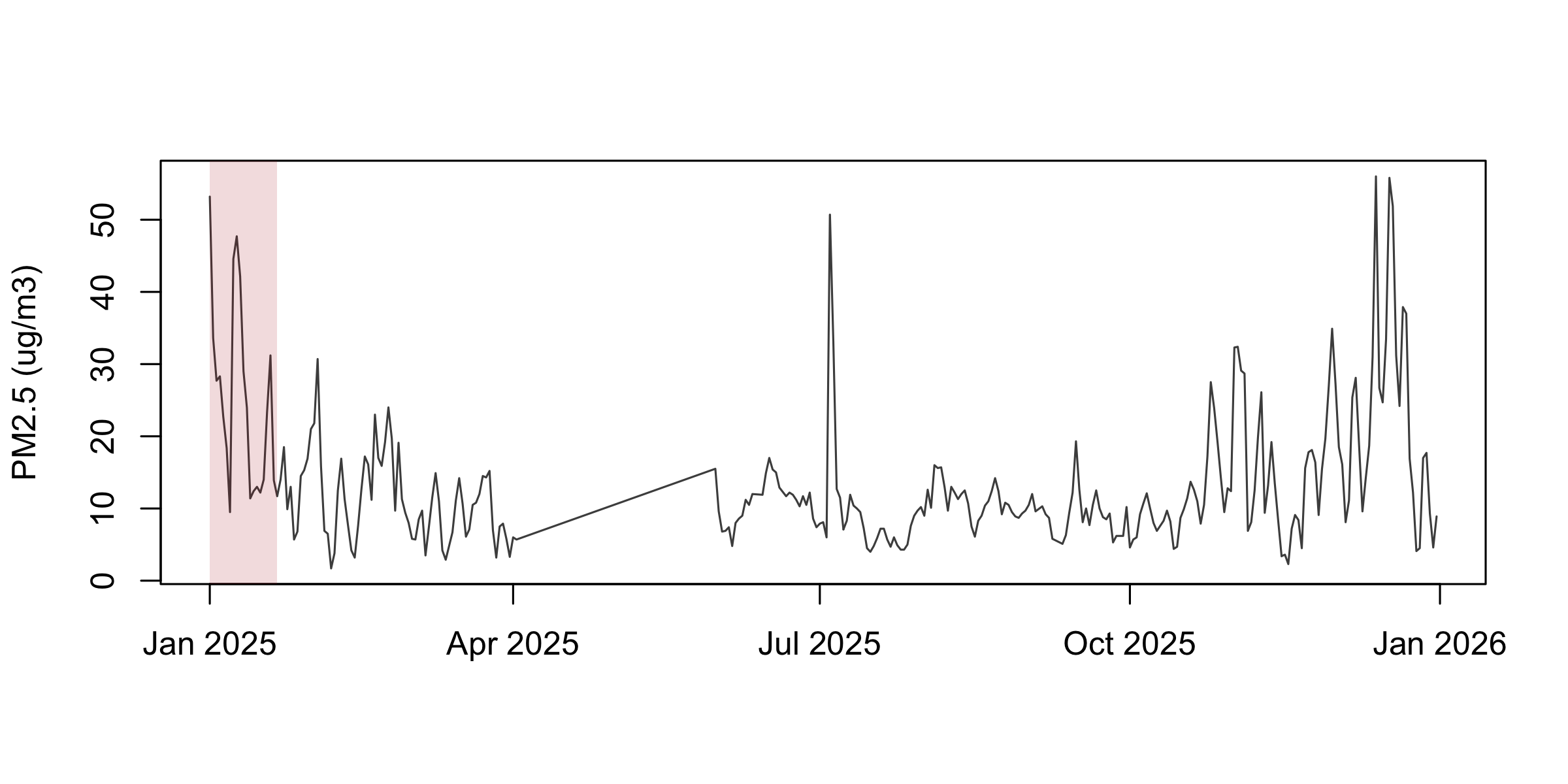
Compton's 2025 series as a line with a translucent grey band covering the first three weeks of January.

rect() takes the four edges, and adjustcolor(col, alpha.f = ) makes any colour translucent so the data still shows through. All four edge arguments are vectorised, so one call can shade many windows.

Confidence bands: polygon()

set.seed(2)
x <- runif(200, 0, 10)
y <- 20 + 3*x - 1.5*x^2 + 0.11*x^3 + 5*rnorm(200)
fit  <- lm(y ~ x + I(x^2) + I(x^3))
X    <- cbind(1, x, x^2, x^3)
se   <- sqrt(diag(X %*% vcov(fit) %*% t(X)))
i    <- order(x)

plot(x, y, pch = 21, col = "grey40", bg = "grey85", xlab = "x", ylab = "y")
polygon(c(x[i], rev(x[i])),
        c(fitted(fit)[i] + 1.96*se[i], rev(fitted(fit)[i] - 1.96*se[i])),
        col = adjustcolor("#b31b1b", alpha.f = 0.25), border = NA)
lines(x[i], fitted(fit)[i], col = "#b31b1b", lwd = 2)

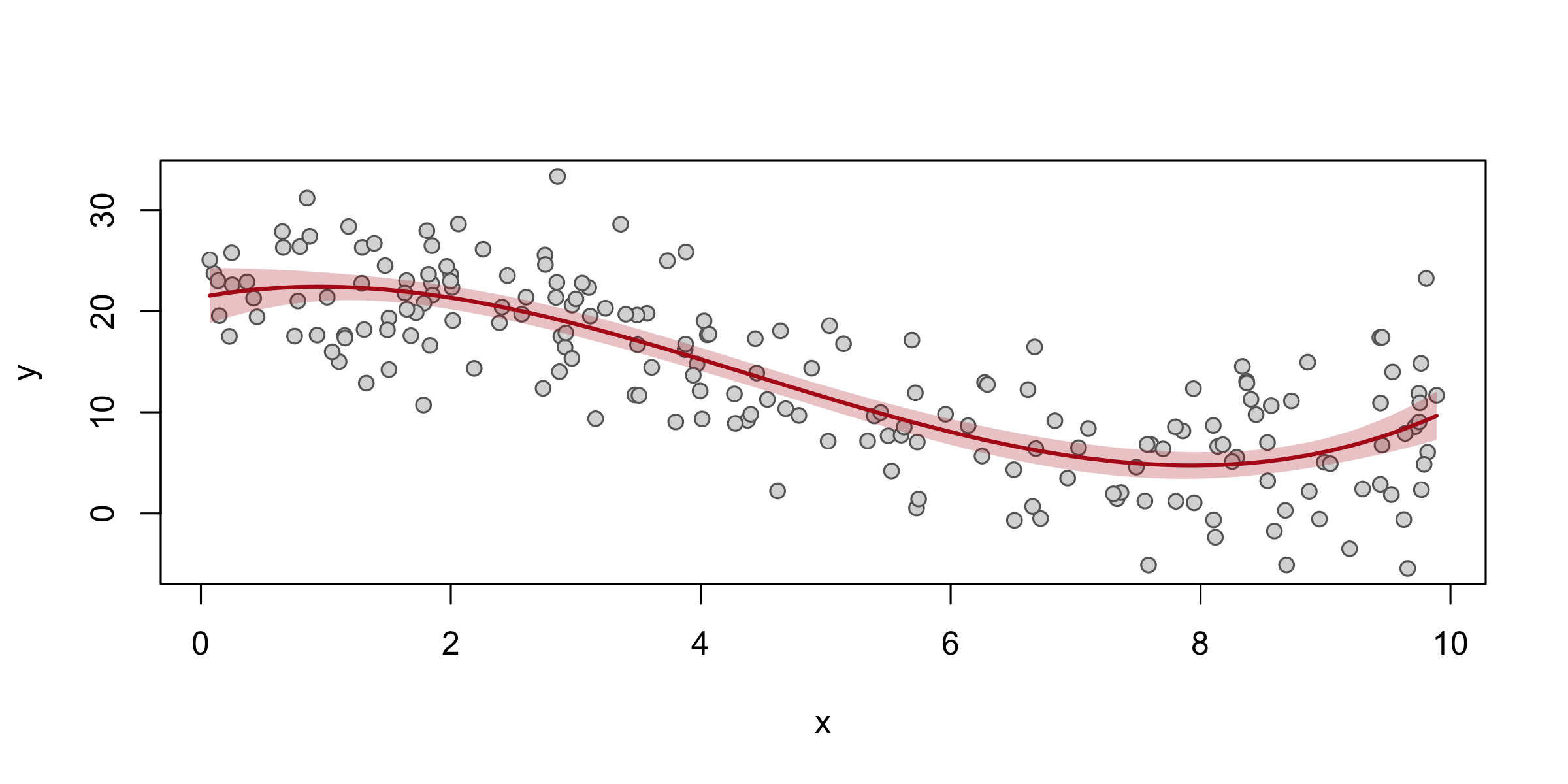
A scatter of simulated points with a red fitted cubic curve through them and a translucent red band around the curve widening at both ends.

polygon() takes one closed ring of coordinates. The idiom is x forwards then x backwards, upper forwards then lower backwards — that traces the band’s outline in one loop. Every confidence band, event-study plot and dose-response figure you will ever draw is this shape.

Exercise 1

# Three minutes. "A layout in use" put the January line on top of the two
# histograms. Turn it on its side.
#
# 1. Write the matrix() call that stacks the two histograms on the LEFT and
#    gives the January line one tall panel on the RIGHT. The line is still
#    drawn first.
# 2. Check it with layout.show(3) before you draw anything.
# 3. Make the right column twice as wide as the left. Which argument?
#
# Two answers to compare with the room: your matrix, and one argument name.
layout(matrix(c(2, 3, 1, 1), nrow = 2), widths = c(1, 2))
layout.show(3)
layout(1)

The line is drawn first, so it is panel 1 and it fills the whole right column. matrix() fills down column 1 first (2 over 3), then column 2 (1 over 1). The argument is widths, a ratio like heights.

Colour scales

library(RColorBrewer)
#> Warning: package 'RColorBrewer' was built under R version 4.3.3
cols <- colorRampPalette(brewer.pal(11, "Spectral"))(100)
v    <- runif(200, 0, 100)
plot(v, seq_along(v), pch = 16, col = cols[findInterval(v, seq(0, 100, length.out = 100))],
     xlab = "value", ylab = "")

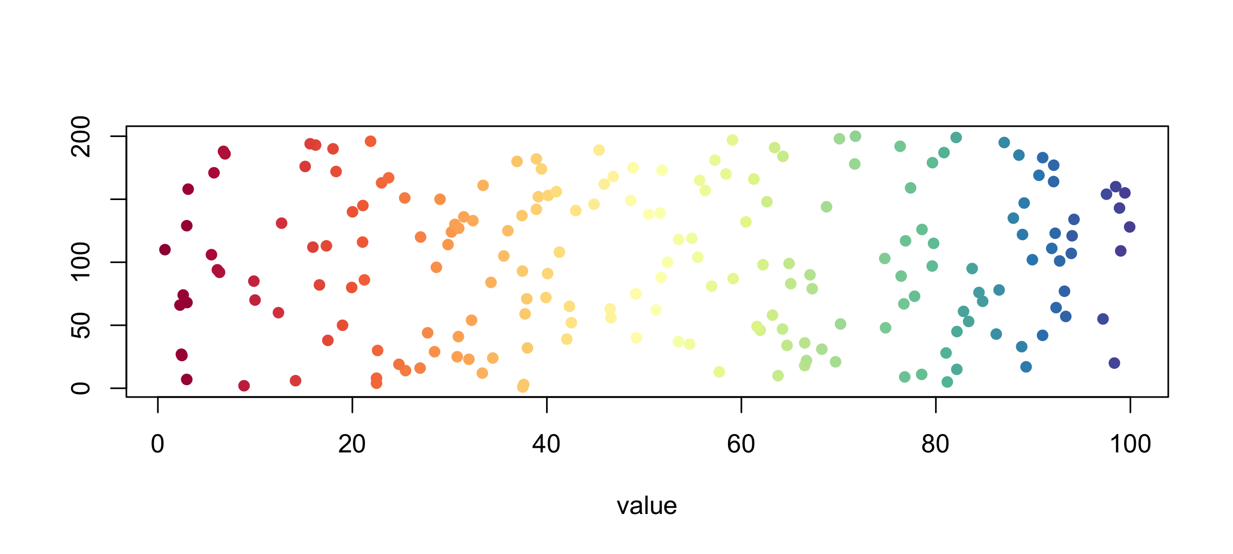
A strip of 200 points coloured along a red-to-blue spectral ramp from left to right.

brewer.pal(n, name) gives a designed palette (display.brewer.all() shows them all), colorRampPalette() interpolates it to any length, and findInterval() turns a numeric column into positions in that palette. Those three lines are how every choropleth and heat map gets its colours.

Custom axes

op <- par(mar = c(3, 4, 1, 1))
plot(comp_y$date, comp_y$pm25, type = "l", col = "grey30",
     axes = FALSE, xlab = "", ylab = "")
firsts <- as.Date(paste0("2025-", sprintf("%02d", 1:12), "-01"))
axis(1, at = firsts, labels = month.abb)
axis(1, at = firsts + 15, tck = -0.01, lwd = 0, lwd.tick = 1, labels = FALSE)
axis(2, las = 2)
box()
mtext("PM2.5 (ug/m3)", side = 2, line = 2.5)
par(op)

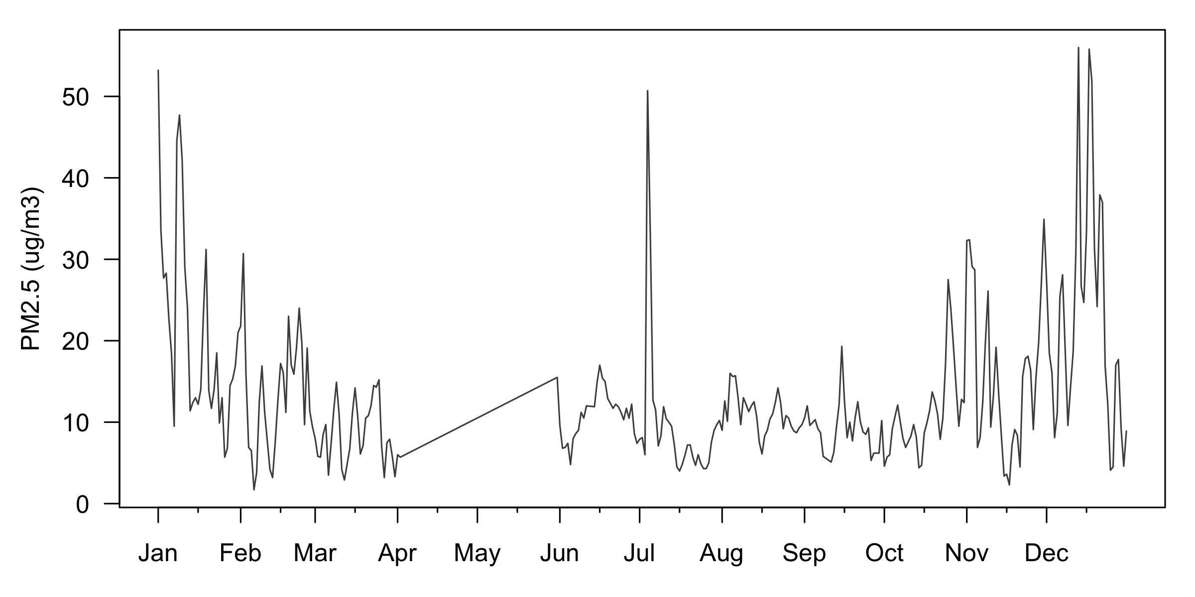
Compton's 2025 series with no default axes: month abbreviations along the bottom, minor ticks between them, horizontal y numbers, a box around the plot, and a margin label reading PM2.5.

axes = FALSE suppresses both axes so you can draw your own. A second axis() call on the same side with labels = FALSE and a small tck gives minor ticks. box() puts the frame back.

par(xpd): drawing outside the plot region

lanc <- jan[jan$site == "Lancaster - Fairgrounds", ]
op   <- par(mfrow = c(1, 2), mar = c(5, 4, 3, 1))

for (clip in c(FALSE, NA)) {
  plot(comp$date, comp$pm25, type = "l", lwd = 2, col = "#b31b1b", xlim = xr,
       ylim = c(0, 60), xlab = "", ylab = "PM2.5 (ug/m3)",
       main = paste("xpd =", clip))
  lines(lanc$date, lanc$pm25, lwd = 2, col = "grey50")
  legend(xr[1], -18, c("Compton", "Lancaster"), col = c("#b31b1b", "grey50"),
         lwd = 2, bty = "n", horiz = TRUE, xpd = clip)
}

par(op)

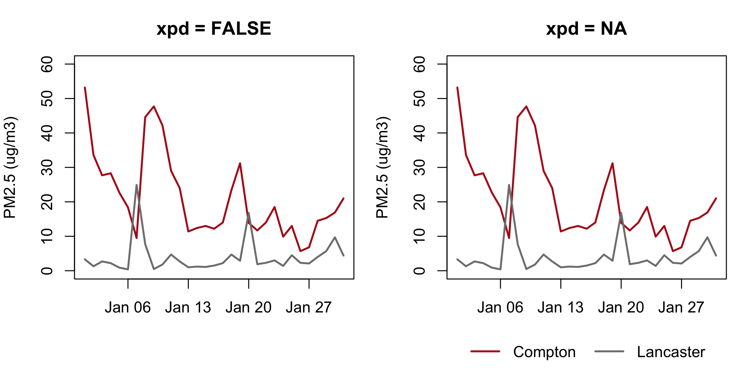
Two panels of the same January figure with Compton in red and Lancaster in grey. The left panel, xpd = FALSE, has no legend at all. The right panel, xpd = NA, carries the same legend on one line below the date axis.

Anything drawn outside the axes is clipped away, silently: the left legend() call ran and produced nothing at all. xpd says where the clipping stops — FALSE is the plot region, TRUE is that panel’s own margins, and NA is the whole device, which is what puts one legend under a grid of panels. Every drawing function takes xpd = on its own call, and par(xpd = NA) sets it for everything after.

The negative y in the legend() call is the giveaway: those coordinates are read in the panel’s own units, so a legend below the axis sits at a negative height. Clipping is usually what you want — it is why the shaded rect() earlier stopped at the edge of the plot instead of bleeding into the margin.

Fills, shapes, and options

op <- par(mfrow = c(2, 2), mar = c(3, 3, 2, 1))
hist(d$pm25, breaks = 30, col = "#b31b1b", density = 25, angle = 45,
     border = "#b31b1b", main = "density = / angle =", xlab = "")

m <- table(format(d$date, "%m"), d$site)[1:4, ]
barplot(m, col = grey.colors(4), main = "stacked", las = 2, cex.names = 0.5)
barplot(m, col = grey.colors(4), beside = TRUE, space = c(0, 2),
        main = "beside = TRUE", las = 2, cex.names = 0.5)

boxplot(pm25 ~ site, data = d, notch = TRUE, boxwex = 0.5,
        main = "notch = / boxwex =", xlab = "", ylab = "", names = rep("", 4))
par(op)

Four panels: a hatched histogram, a stacked bar chart, a side-by-side bar chart, and notched box plots.

A matrix handed to barplot() stacks by default and sits side by side with beside = TRUE. notch = TRUE cuts a wedge around the median whose width is a rough confidence interval: non-overlapping notches are a hint the medians differ. hist() also returns what it drew — h <- hist(x, plot = FALSE) gives you h$breaks and h$counts as ordinary vectors.

Heat maps: image()

mm <- tapply(d$pm25, list(d$site, format(d$date, "%m")), mean)
op <- par(mar = c(3, 12, 2, 1))
image(t(mm), col = colorRampPalette(c("white", "#b31b1b"))(20), axes = FALSE)
axis(1, at = seq(0, 1, length.out = 12), labels = month.abb, tick = FALSE)
mtext(rownames(mm), side = 2, at = seq(0, 1, length.out = 4), las = 2,
      cex = 0.7, line = 0.5)
box()
par(op)

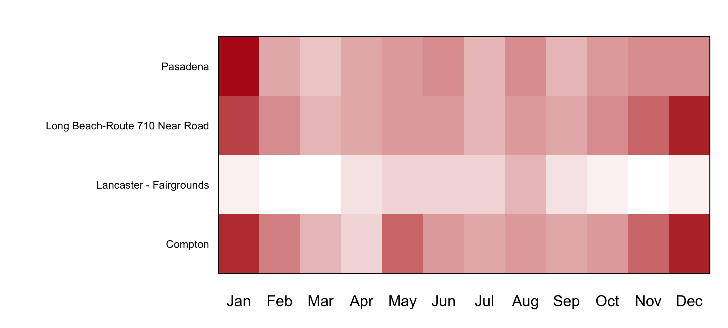
A four-row heat map, one row per station and one column per month, with Lancaster's row consistently pale and the basin rows darker in January and December.

image() draws a matrix as a grid of coloured cells. Note the t(): image() puts the first matrix dimension on the x axis, so a rows-are-sites matrix has to be transposed to get sites down the side.

Exercise 2

# Four minutes. Compton's year as points, coloured by how bad the day was.
#
# 1. Take five colours from the "Reds" Brewer palette.
# 2. Put every reading in comp_y into one of five bands, with cut points at
#    0, 10, 20, 35 and 55, and plot pm25 against date, one colour per band.
# 3. How many days are in the top band, and which colour did they get?
#
# Two answers to compare with the room: a count, and a hex code.
cols <- brewer.pal(5, "Reds")
band <- findInterval(comp_y$pm25, c(0, 10, 20, 35, 55))
plot(comp_y$date, comp_y$pm25, pch = 16, col = cols[band],
     xlab = "", ylab = "PM2.5 (ug/m3)")
sum(band == 5)
#> [1] 2

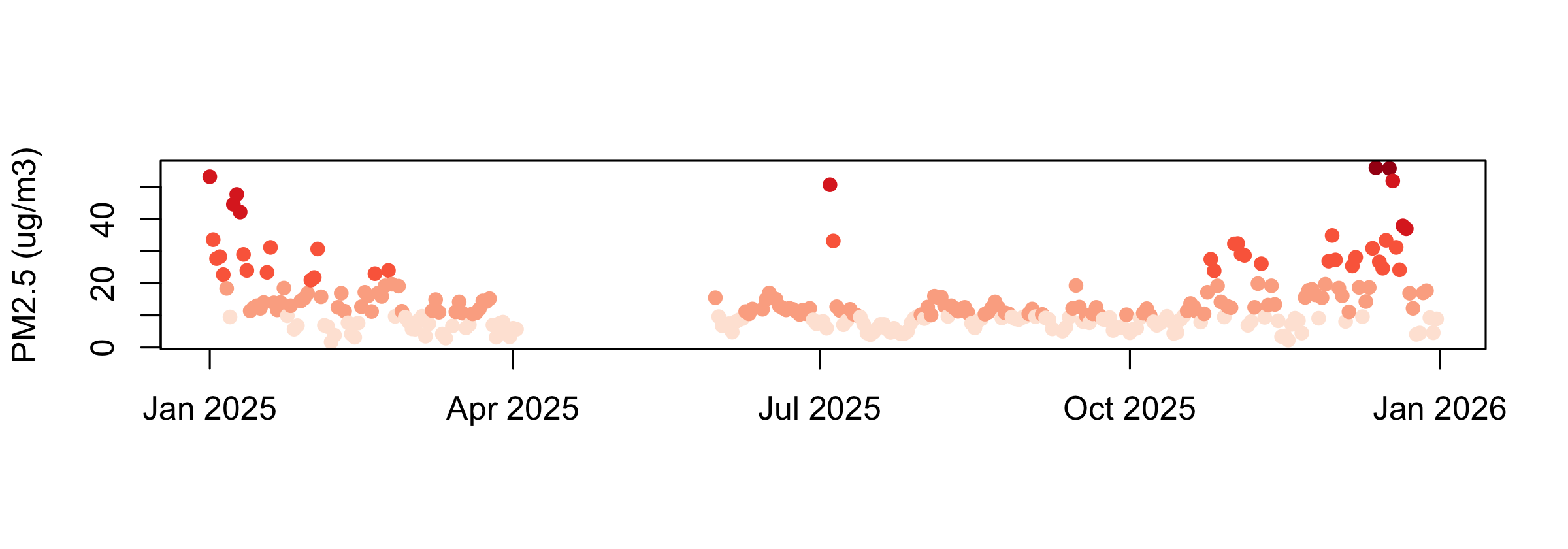
Two days, December 13 and 17, and cols[5] is #A50F15. A reading below the first cut point would get band 0, and cols[0] is nothing: the colour vector comes out one short and R recycles it, so every later point is coloured wrong, silently. Compton has no readings below zero; Lancaster does.

Maps

library(maps)
#> Warning: package 'maps' was built under R version 4.3.3
library(mapproj)
#> Warning: package 'mapproj' was built under R version 4.3.3
op <- par(mfrow = c(1, 2), mar = c(0, 0, 2, 0))
map("state"); title("map(\"state\")")
map("world", proj = "orthographic", orientation = c(15, 260, 0))
#> Warning in map("world", proj = "orthographic", orientation = c(15, 260, :
#> projection failed for some data
map("state", proj = "orthographic", orientation = c(15, 260, 0), add = TRUE)
title("orthographic")
par(op)

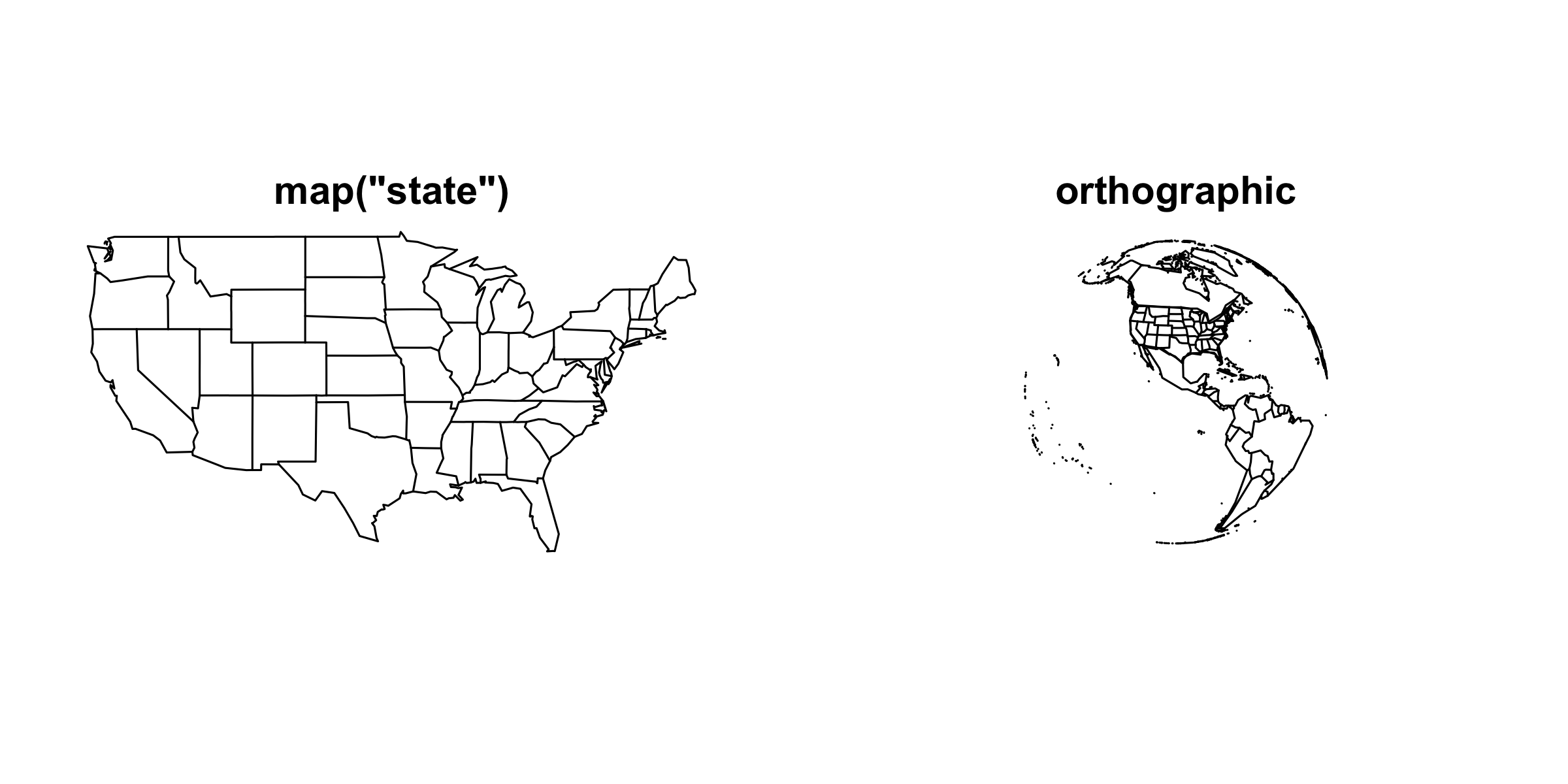
Two panels: an outline map of the lower 48 US states, and an orthographic globe centred on North America with state outlines drawn on it.

maps ships outlines for "world", "usa", "state" and "county". fill = TRUE with a vector of colours in the same order as the map’s own region names gives you a choropleth; add = TRUE layers one map onto another, exactly like lines() onto a plot.

The orthographic call warns projection failed for some data. That is the projection saying it cannot draw the half of the globe facing away from you, which is the correct answer. Nothing is broken.

Animation

library(magick)
frames <- file.path(tempdir(), "frames")
dir.create(frames, showWarnings = FALSE)
for (angle in seq(0, 355, by = 5)) {
  png(file.path(frames, sprintf("frame_%03d.png", angle)), width = 480, height = 480)
  par(mar = c(0, 0, 0, 0))
  map("world", proj = "orthographic", orientation = c(15, angle, 0))
  dev.off()
}
globe <- image_animate(image_read(list.files(frames, full.names = TRUE)), fps = 10)
globe

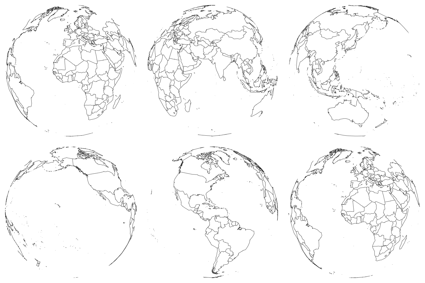
An orthographic globe with country outlines, rotating one full turn.

A GIF is a folder of PNGs shown in order. Everything in that loop is png() and dev.off() plus a counter; image_read() loads the frames and image_animate() strings them together. image_write(globe, "globe.gif") saves it. Any figure you can draw once you can animate.

Practice

# Everything below uses d, comp_y, jan, comp and xr, built at the top of
# this script.

# Unequal panels
#  1. layout(matrix(c(1, 2, 1, 3), nrow = 2)) -- before you run anything,
#     say which cells panel 1 covers. Then check with layout.show(3).
#  2. Fill that layout: Compton's whole year in the tall panel, and
#     histograms of Compton and Lancaster in the two small ones. Put the
#     device back afterwards -- both settings.
#  3. Make the top row of a c(1,1,2,3) layout three times as tall as the
#     bottom. Which argument, and is it in inches?

# Shaded areas
#  4. Redraw Compton's January and shade Jan 1 to Jan 21 in translucent
#     red behind the line. The shading must not hide the data.
#  5. Compton's monthly means: shade every month whose mean is above
#     12 ug/m3. How many bands do you get? Do it with ONE rect() call.
#  6. Overlay Compton's and Lancaster's full-year histograms on one plot
#     with translucent fills. (Hint: hist(..., add = TRUE), and both need
#     the same breaks.)

# Confidence bands
#  7. Fit Compton's pm25 on day-of-year and its square. Draw the fitted
#     curve over a scatter of the raw days, with a 95% band. What does the
#     curve say about the shape of the year?

# Colour scales
#  8. Colour the AQI-versus-PM2.5 scatter by month, using a 12-colour ramp
#     built from a Brewer palette. Add a legend.
#  9. Bucket the four annual means into 5 classes with findInterval() and
#     draw a bar chart coloured by bucket.

# Custom axes
# 10. Compton's year with NO default axes: month names along the bottom,
#     small unlabelled ticks at mid-month, horizontal y numbers, a box,
#     and the y label written with mtext().

# Fills, shapes, options
# 11. Days reported per month per station, once stacked and once beside.
#     Which of the two answers "did every station report every month?"
# 12. Box plots by station with notch = TRUE. Which stations' medians are
#     clearly different, and which are not?

# Heat maps and maps
# 13. Site-by-month heat map of mean PM2.5, with the sites sorted by their
#     annual mean. Which site is the outlier, and which month is worst?
# 14. Draw California and put the four monitors on it, sized by annual
#     mean. The coordinates are already in the file.
# 1  panel 1 covers BOTH cells of column 1 -- matrix() fills down the
#    first column, so c(1, 2, 1, 3) with nrow = 2 is column 1 = (1, 2)
#    and column 2 = (1, 3). Panel 1 is repeated, so it spans the rows.
layout(matrix(c(1, 2, 1, 3), nrow = 2)); layout.show(3); layout(1)

# 2
op <- par(mar = c(3, 4, 2, 1))
layout(matrix(c(1, 2, 1, 3), nrow = 2))
plot(comp_y$date, comp_y$pm25, type = "l", xlab = "", ylab = "PM2.5",
     main = "Compton 2025")
hist(comp_y$pm25, breaks = seq(-5, 60, 5), main = "Compton", xlab = "")
hist(d$pm25[d$site == "Lancaster - Fairgrounds"], breaks = seq(-5, 60, 5),
     main = "Lancaster", xlab = "")
layout(1); par(op)

# 3  heights =, and they are RATIOS, not inches
layout(matrix(c(1, 1, 2, 3), nrow = 2, byrow = TRUE), heights = c(3, 1))
layout.show(3); layout(1)

# 4  draw the rectangle FIRST, or use a translucent fill, or the shading
#    covers the line. Here: line, then translucent rect, then line again.
plot(comp$date, comp$pm25, type = "l", lwd = 2, xlab = "", ylab = "PM2.5")
rect(as.Date("2025-01-01"), -5, as.Date("2025-01-21"), 80,
     col = adjustcolor("#b31b1b", alpha.f = 0.15), border = NA)
lines(comp$date, comp$pm25, lwd = 2)

# 5  five months: 01, 02, 05, 11, 12. rect() is vectorised, so one call
#    with vectors of edges draws all five.
cm    <- tapply(comp_y$pm25, format(comp_y$date, "%m"), mean)
hot   <- names(cm)[cm > 12]
left  <- as.Date(paste0("2025-", hot, "-01"))
right <- left + 31
plot(comp_y$date, comp_y$pm25, type = "l", xlab = "", ylab = "PM2.5")
rect(left, -5, right, 80, col = adjustcolor("#b31b1b", 0.12), border = NA)
lines(comp_y$date, comp_y$pm25)
length(hot)

# 6
br <- seq(-5, 60, 2.5)
hist(comp_y$pm25, breaks = br, col = adjustcolor("#b31b1b", 0.5),
     border = NA, main = "", xlab = "PM2.5 (ug/m3)")
hist(d$pm25[d$site == "Lancaster - Fairgrounds"], breaks = br,
     col = adjustcolor("#1f6fb4", 0.5), border = NA, add = TRUE)
legend("topright", c("Compton", "Lancaster"), bty = "n",
       fill = adjustcolor(c("#b31b1b", "#1f6fb4"), 0.5))

# 7  a U: high in January, a trough through spring and summer, rising
#    again into December. The band is narrow in the middle where the data
#    is dense and flares at both ends. R-squared is only 0.21 -- the
#    seasonal shape is real but it explains a fifth of the variation.
day <- as.numeric(comp_y$date - as.Date("2025-01-01"))
fit <- lm(comp_y$pm25 ~ day + I(day^2))
X   <- cbind(1, day, day^2)
se  <- sqrt(diag(X %*% vcov(fit) %*% t(X)))
i   <- order(day)
plot(comp_y$date, comp_y$pm25, pch = 16, cex = 0.5, col = "grey60",
     xlab = "", ylab = "PM2.5 (ug/m3)")
polygon(c(comp_y$date[i], rev(comp_y$date[i])),
        c((fitted(fit) + 1.96 * se)[i], rev((fitted(fit) - 1.96 * se)[i])),
        col = adjustcolor("#b31b1b", 0.25), border = NA)
lines(comp_y$date[i], fitted(fit)[i], col = "#b31b1b", lwd = 2)
summary(fit)$r.squared

# 8
library(RColorBrewer)
mon  <- as.numeric(format(d$date, "%m"))
cols <- colorRampPalette(brewer.pal(11, "Spectral"))(12)
plot(d$pm25, d$Daily.AQI.Value, pch = 16, cex = 0.6, col = cols[mon],
     xlab = "Daily mean PM2.5 (ug/m3)", ylab = "Daily AQI")
legend("bottomright", month.abb, col = cols, pch = 16, ncol = 2,
       bty = "n", cex = 0.7)

# 9  Lancaster 4.48, Pasadena 11.67, Long Beach 12.21, Compton 13.38 --
#    Lancaster lands in its own bucket and the other three share one
am  <- sort(tapply(d$pm25, d$site, mean))
brk <- seq(0, 15, length.out = 6)
pal <- colorRampPalette(c("white", "#b31b1b"))(5)
op  <- par(mar = c(4, 15, 1, 1))
barplot(am, horiz = TRUE, las = 1, col = pal[findInterval(am, brk)],
        xlab = "Mean PM2.5, 2025 (ug/m3)")
par(op)

# 10
op <- par(mar = c(3, 5, 1, 1))
plot(comp_y$date, comp_y$pm25, type = "l", col = "grey30",
     axes = FALSE, xlab = "", ylab = "")
firsts <- as.Date(paste0("2025-", sprintf("%02d", 1:12), "-01"))
axis(1, at = firsts, labels = month.abb)
axis(1, at = firsts + 15, tck = -0.01, lwd = 0, lwd.tick = 1, labels = FALSE)
axis(2, las = 2)
box()
mtext("Daily PM2.5 (ug/m3)", side = 2, line = 3)
par(op)

# 11  BESIDE answers it. A stacked bar shows the month's total across all
#     four stations, so a station reporting nothing is invisible inside
#     someone else's bar; side by side, a missing station is a missing bar.
m  <- table(format(d$date, "%m"), d$site)
op <- par(mfrow = c(2, 1), mar = c(3, 4, 2, 1))
barplot(t(m), col = grey.colors(4), main = "stacked")
barplot(t(m), col = grey.colors(4), beside = TRUE, main = "beside = TRUE")
par(op)

# 12  Lancaster (4.20) is clearly different from all three others. Compton
#     (10.70) and Long Beach (10.65) are not different at all -- their
#     notches overlap almost completely. Pasadena (9.30) is borderline
#     against both, and it has the fewest days, which is why its notch is
#     the widest.
boxplot(pm25 ~ site, data = d, notch = TRUE, names = c("Com", "Lan", "LB", "Pas"),
        xlab = "", ylab = "PM2.5 (ug/m3)")

# 13  Lancaster is the outlier row, pale all year. December and January
#     are the worst columns -- and December is worse than January at
#     three of the four sites.
mm <- tapply(d$pm25, list(d$site, format(d$date, "%m")), mean)
mm <- mm[order(rowMeans(mm)), ]
op <- par(mar = c(3, 12, 2, 1))
image(t(mm), col = colorRampPalette(c("white", "#b31b1b"))(20), axes = FALSE)
axis(1, at = seq(0, 1, length.out = 12), labels = month.abb, tick = FALSE)
mtext(rownames(mm), side = 2, at = seq(0, 1, length.out = 4), las = 2,
      cex = 0.7, line = 0.5)
box()
par(op)

# 14  Lancaster sits north of the mountains; the other three cluster in
#     the basin, which is the whole reason its readings differ
library(maps)
co <- unique(d[, c("site", "Site.Latitude", "Site.Longitude")])
co$mean <- tapply(d$pm25, d$site, mean)[co$site]
map("state", region = "california")
points(co$Site.Longitude, co$Site.Latitude, pch = 21, bg = "#b31b1b",
       cex = co$mean / 4)
text(co$Site.Longitude, co$Site.Latitude, round(co$mean, 1), pos = 4, cex = 0.7)
Quick reference

Code What it does
layout(m, heights =, widths =) panels of unequal size; m is a matrix of fill positions, a repeated number spans cells, 0 leaves a cell empty
layout.show(n) draw the empty numbered regions before spending plots on them
layout(1) the reset — par(op) does not undo a layout
rect(xleft, ybottom, xright, ytop) a rectangle; all four edges are vectorised
adjustcolor(col, alpha.f = 0.2) make any colour translucent
polygon(x, y) one closed ring; for a band, x forwards then backwards, upper then lower
brewer.pal(n, "Spectral") a designed palette; display.brewer.all() shows them all
colorRampPalette(cols)(100) interpolate a palette to any length
findInterval(x, breaks) turn a numeric column into palette positions
axes = FALSE suppress both axes so you can draw your own
axis(1, at =, labels =, tck =, lwd.tick =) your own axis; labels = FALSE with a small tck gives minor ticks
box() put the frame back after axes = FALSE
legend(..., xpd = NA) draw outside the axes: FALSE = plot region, TRUE = the panel’s margins, NA = the device
hist(..., density =, angle =, border =) hatched fills
hist(x, plot = FALSE)$counts the bin heights without drawing
barplot(m, beside = TRUE, space =) a matrix side by side instead of stacked
boxplot(..., notch = TRUE, boxwex =) notches as a rough median CI; box width
image(t(m)) a matrix as coloured cells — note the transpose
map("state"), map(..., fill =, add =, proj =) outlines, choropleths, projections
png() in a loop, then stitch a GIF is a folder of PNGs in order