AEM 6850

Empirical Methods for Applied Economists

Prof. Ariel Ortiz-Bobea

4 · Basic plots I

Thursday, September 3, 2026

Cornell University

Objectives

By the end of this session you can:

  • Name the plot that matches a question, and say what each one is bad at.
  • Draw one series through time, and several series on shared axes.
  • Read a distribution with hist(), and say when a box plot answers better.
  • Move the same argument — col, main, las, ylim — between plot(), hist(), boxplot() and barplot().
  • Split a device into panels, control which panel fills first, and put it back.
  • Write a figure to a file at a resolution someone else can use.

Why plot

Let your imagination be the limit to what you can ask and explore, not the tools you happen to know.

  • Humans are visual animals. Vision is a fundamental way we interact with the world.
  • Seeing a physical representation of numbers is often more impactful and easier to understand than the numbers themselves.
  • As a result, visualization is one of the most important skills in research (conducting it and communicating its results)

Visualization and the questions you ask

  • There is often more to learn from staring at the data than looking at numeric summaries of such data.
  • My invitation is that you cultivate a visual way to interact with data so that you can think “outside the menu” of visualization tools at your disposal.
  • The figures you can build can influence the hypothesis you come up with. They empower your curiosity.

Getting the data

One file: every PM2.5 monitor in Los Angeles County for 2025. This chunk fetches it if you do not already have it, and does nothing if you do.

dir.create("data", showWarnings = FALSE)

f <- "data/epa_pm25_la_county_2025.csv"
if (!file.exists(f)) {
  download.file(paste0("https://arielortizbobea.github.io/aem6850/",
                       "fall-2026/sessions/", f), f)
}

file.exists(f)
#> [1] TRUE
Building the working table

We take four monitors on a line across the basin.

pm <- read.csv("data/epa_pm25_la_county_2025.csv",
               colClasses = c("Site.ID" = "character"))

names(pm)[names(pm) == "Daily.Mean.PM2.5.Concentration"] <- "pm25"
names(pm)[names(pm) == "Local.Site.Name"]                <- "site"
pm$date <- as.Date(pm$Date, format = "%m/%d/%Y")

Four stations on a transect

transect <- c("Pasadena", "Compton",
              "Long Beach-Route 710 Near Road", "Lancaster - Fairgrounds")

d <- pm[pm$site %in% transect &
        pm$POC == 1 & pm$AQS.Parameter.Code == 88101, ]

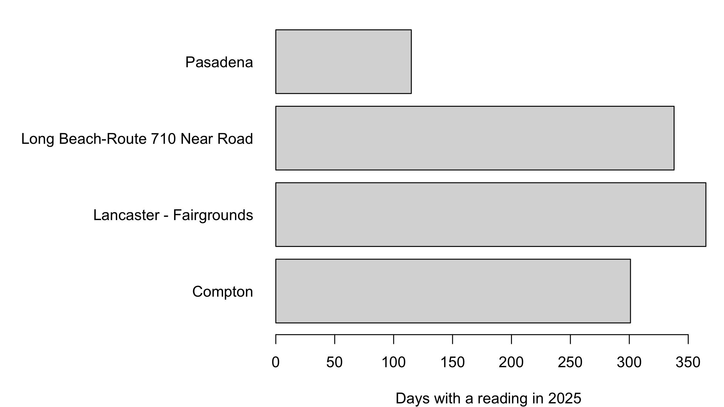
table(d$site)
#> 
#>                        Compton        Lancaster - Fairgrounds 
#>                            301                            365 
#> Long Beach-Route 710 Near Road                       Pasadena 
#>                            338                            115

Lancaster reported 365 days. Pasadena reported 115. Every plot below has to survive that.

plot(): one series through time

comp_y <- d[d$site == "Compton", ]
plot(comp_y$date, comp_y$pm25, type = "l",
     xlab = "", ylab = "Daily PM2.5 (ug/m3)")
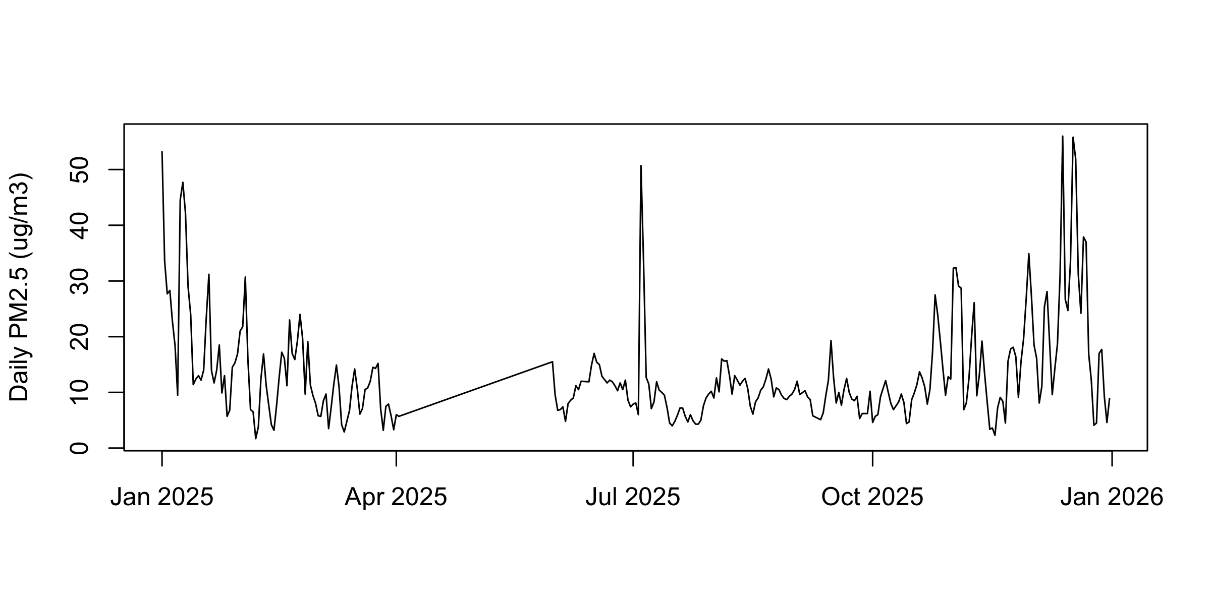
comp_y$date[which.max(comp_y$pm25)]
#> [1] "2025-12-13"
Daily PM2.5 at Compton across all of 2025 as a single line. A tall cluster in early January, a sharp isolated spike in early July, a flat gap in April and May, and a high ragged run through December.

One plot() call is one series

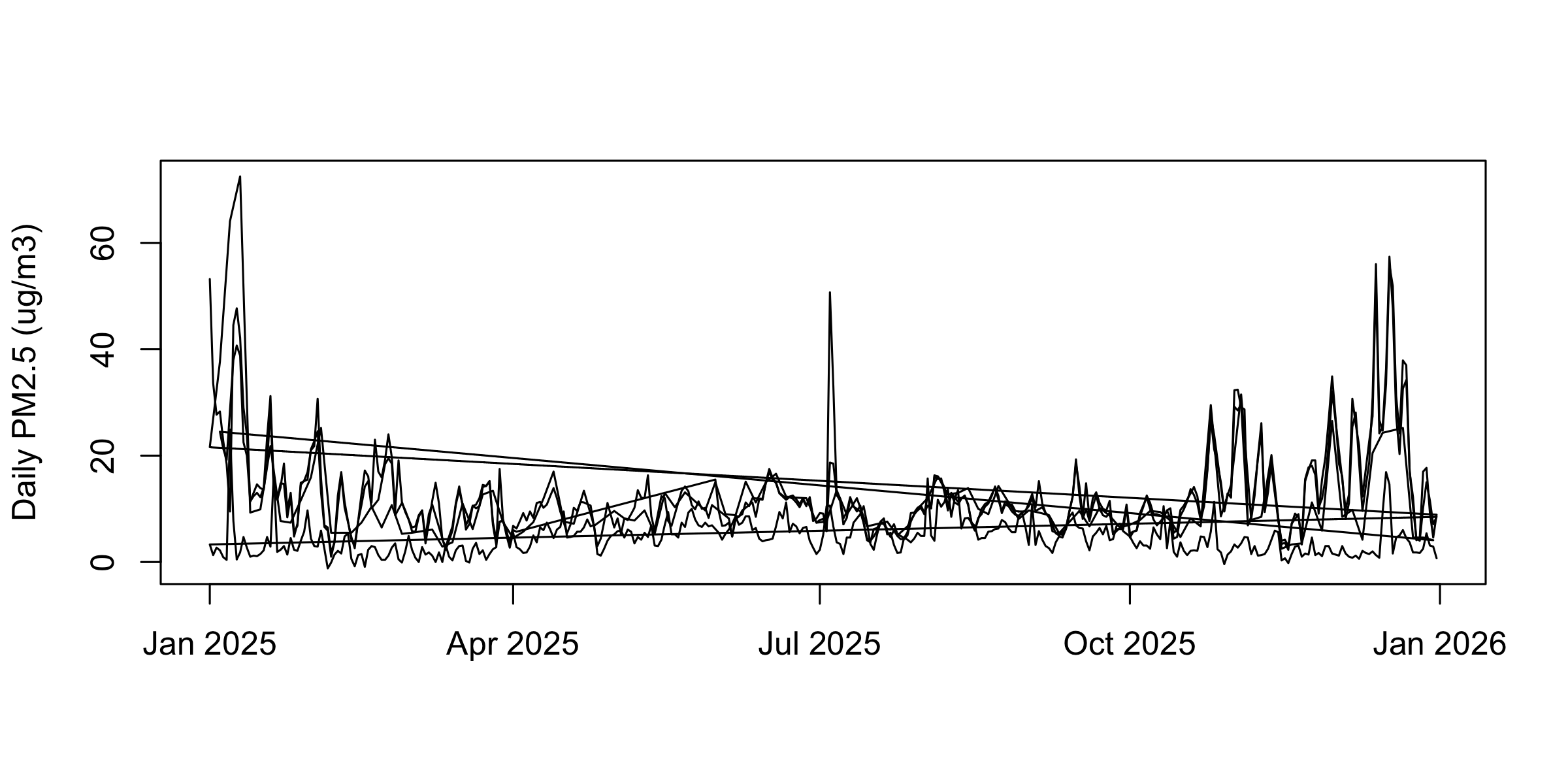
The same call on the whole four-station frame draws three long diagonal strokes.

plot(d$date, d$pm25, type = "l",
     xlab = "", ylab = "Daily PM2.5 (ug/m3)")
The whole four-station frame drawn as one line: a dense band of daily variation crossed by three long diagonal strokes running from the right edge back to the left.

Cutting to January

jan  <- d[d$date < as.Date("2025-02-01"), ]
comp <- jan[jan$site == "Compton", ]
lb   <- jan[jan$site == "Long Beach-Route 710 Near Road", ]
lanc <- jan[jan$site == "Lancaster - Fairgrounds", ]
pas  <- jan[jan$site == "Pasadena", ]

xr   <- as.Date(c("2025-01-01", "2025-01-31"))   # one window for every panel

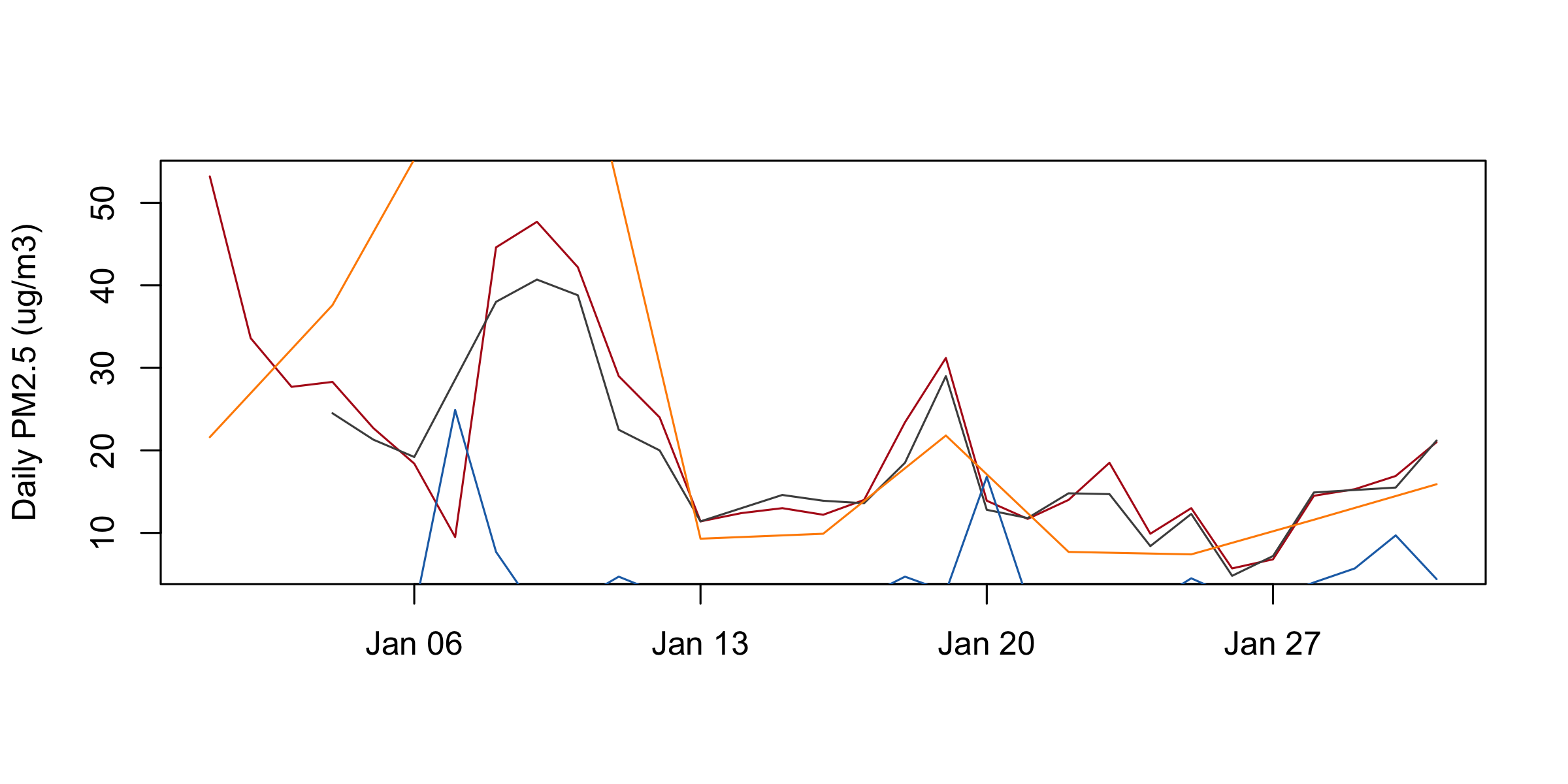
lines() and points(): several series

plot(comp$date, comp$pm25, type = "l", col = "#b31b1b",
     xlab = "", ylab = "Daily PM2.5 (ug/m3)")
lines(lb$date,   lb$pm25,   col = "grey30")
lines(lanc$date, lanc$pm25, col = "#1f6fb4")
lines(pas$date,  pas$pm25,  col = "darkorange")
January PM2.5 at four stations. Compton in red and Long Beach in grey track each other. The blue Lancaster line is cut off below the bottom of the frame for most of the month. The orange Pasadena line leaves the top of the frame twice and runs as long straight diagonals between its few observations.

Setting the window and the key

plot(comp$date, comp$pm25, type = "l", col = "#b31b1b", lwd = 2,
     ylim = c(0, 75), xlab = "", ylab = "Daily PM2.5 (ug/m3)")
lines(lb$date,   lb$pm25,   col = "grey30")
lines(lanc$date, lanc$pm25, col = "#1f6fb4")
points(pas$date, pas$pm25,  col = "darkorange", pch = 16)
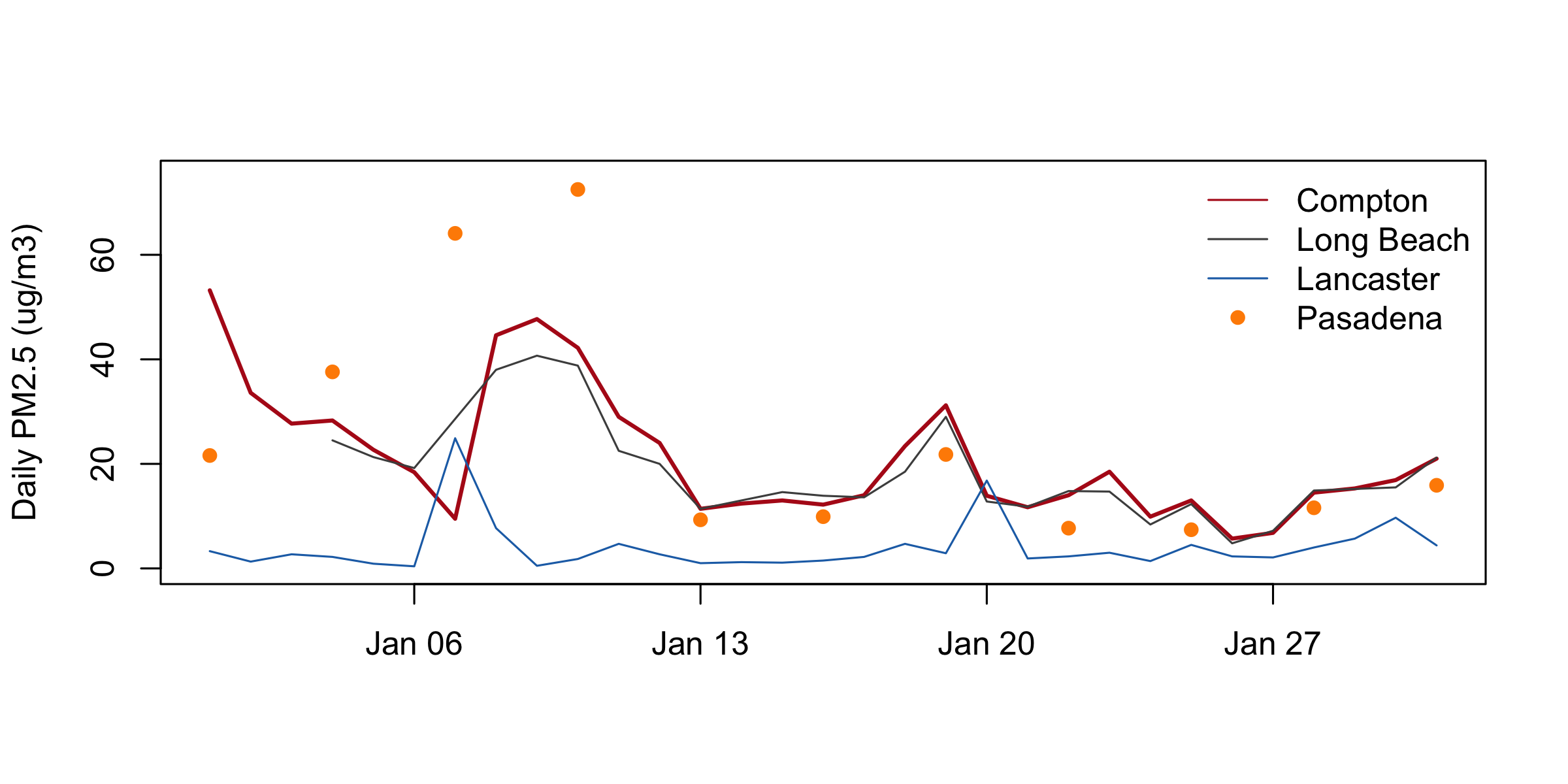
legend("topright", c("Compton", "Long Beach", "Lancaster", "Pasadena"),
       col = c("#b31b1b", "grey30", "#1f6fb4", "darkorange"),
       lty = c(1, 1, 1, NA), pch = c(NA, NA, NA, 16), bty = "n")
The corrected figure. The y axis runs 0 to 75 so every series fits. Compton is a thick red line, Long Beach grey, Lancaster blue, and Pasadena appears as eleven orange dots, the highest at 72.5 on January 10. A key with no box sits in the top right.

hist(): the distribution of one variable

hist(d$pm25, breaks = 40, col = "grey85",
     main = "", xlab = "Daily mean PM2.5 (ug/m3)")
abline(v = 0, col = "#b31b1b", lty = 2)
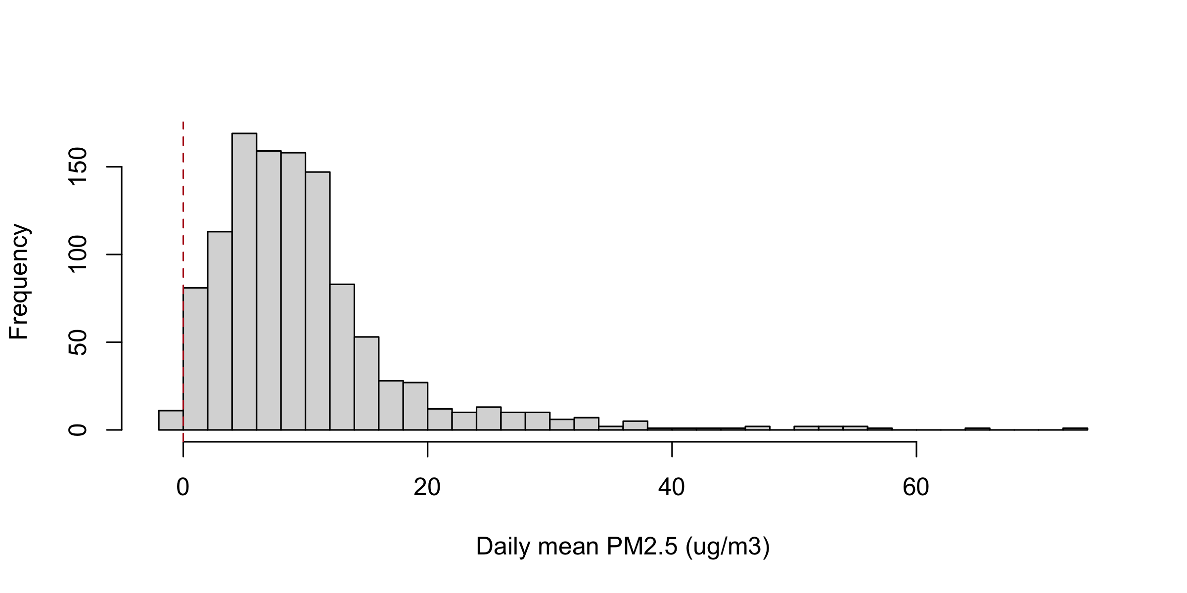
Histogram of daily PM2.5 across the four stations with forty bins requested. The mass piles up between 0 and 15 with a long thin tail past 70. The leftmost bar sits left of zero, separated from the main mass, and a dashed red vertical line marks zero.

What the histogram says

summary(d$pm25)
#>    Min. 1st Qu.  Median    Mean 3rd Qu.    Max. 
#>  -1.200   4.900   8.400   9.947  12.100  72.500

Right-skewed: mean 9.947 above median 8.400.

And there is a bar left of zero. Nobody asked for that.

Four columns with the same mean and sd

set.seed(1)
std <- function(x, m = 20, s = 8) (x - mean(x)) / sd(x) * s + m
q   <- list("Normal"       = std(rnorm(500)),
            "Two humps"    = std(c(rnorm(250, -2), rnorm(250, 2))),
            "Right-skewed" = std(rlnorm(500, 0, 1)),
            "Flat"         = std(runif(500)))

round(sapply(q, function(x) c(mean = mean(x), sd = sd(x), max = max(x))), 2)
#>      Normal Two humps Right-skewed  Flat
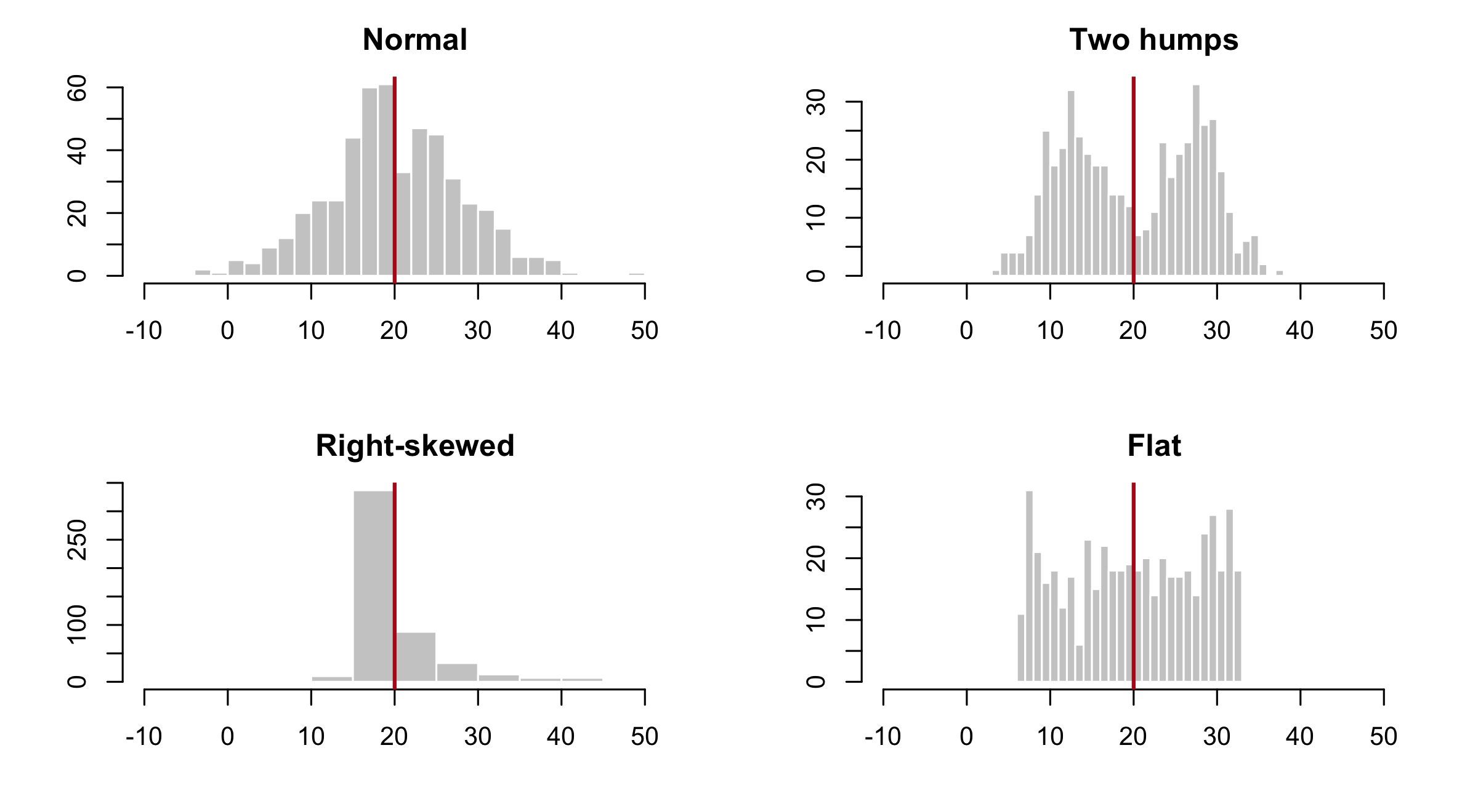
#> mean  20.00     20.00        20.00 20.00
#> sd     8.00      8.00         8.00  8.00
#> max   49.94     37.72       138.53 32.97

The same four columns as histograms

op <- par(mfrow = c(2, 2), mar = c(4, 4, 2.5, 1))
invisible(lapply(names(q), function(nm) {
  hist(q[[nm]], breaks = 30, xlim = c(-10, 55), col = "grey80",
       border = "white", main = nm, xlab = "", ylab = "")
  abline(v = mean(q[[nm]]), col = "#b31b1b", lwd = 2)
}))
par(op)
Four histograms in a two-by-two grid: a bell, two separated humps, a hard right skew with a long thin tail, and a flat block. A red vertical line marks the mean in each, at the same place.

Anscombe’s quartet: four identical summaries

round(colMeans(anscombe), 2)
#>  x1  x2  x3  x4  y1  y2  y3  y4 
#> 9.0 9.0 9.0 9.0 7.5 7.5 7.5 7.5
round(c(cor(anscombe$x1, anscombe$y1), cor(anscombe$x2, anscombe$y2),
        cor(anscombe$x3, anscombe$y3), cor(anscombe$x4, anscombe$y4)), 3)
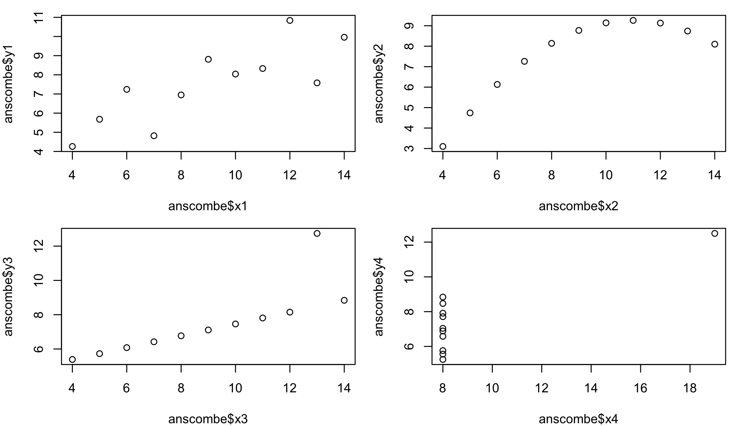
#> [1] 0.816 0.816 0.816 0.817

Anscombe’s quartet: four different pictures

op <- par(mfrow = c(2, 2), mar = c(4, 4, 1, 1))
plot(anscombe$x1, anscombe$y1)
plot(anscombe$x2, anscombe$y2)
plot(anscombe$x3, anscombe$y3)
plot(anscombe$x4, anscombe$y4)
par(op)
Anscombe's four datasets as four scatterplots: a loose linear cloud, a smooth arch, a tight line with one far outlier, and a vertical stack of identical x values with one point far to the right.

boxplot(): one column by groups

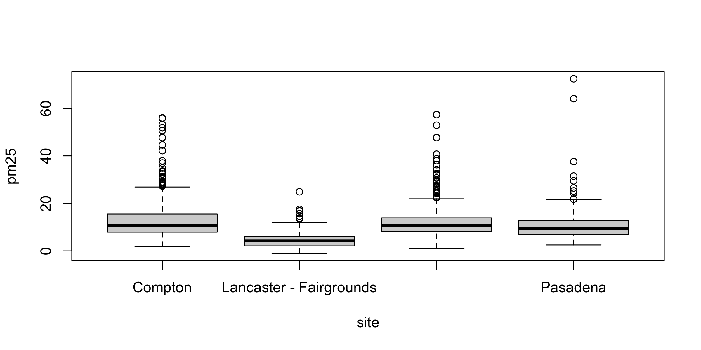
boxplot(pm25 ~ site, data = d)
Box plots of daily PM2.5 for four stations in alphabetical order: Compton, Lancaster, Long Beach, Pasadena. Lancaster's box, second from the left, is much lower and tighter than the other three, which carry long clouds of outlier dots above them. Only two of the four labels are drawn.

Medians, left to right: 10.70 · 4.20 · 10.65 · 9.30. Three basin stations agree to within a twentieth of a microgram; Lancaster sits at less than half.

Labels R drops without warning

R drew two labels and silently dropped two. Each slot is 1.69 in; "Long Beach-Route 710 Near Road" needs 2.57 in.

Not a boxplot() problem. A canvas problem.

barplot(table()): counts of categories

op <- par(mar = c(4, 15, 1, 1))
barplot(table(d$site), horiz = TRUE, las = 1, col = "grey85",
        xlab = "Days with a reading in 2025")
par(op)
Horizontal bar chart of days reported in 2025, one bar per station in alphabetical order from the bottom: Compton 301, Lancaster 365, Long Beach 338, Pasadena 115. All four station names are legible on the left.

Exercise 1

# Three minutes. The histogram had a bar left of zero.
#
# 1. Print the readings below zero.
# 2. Print which station filed them.
# 3. One sentence: keep them or delete them?
#
# Two answers to compare with the room: a count, and one station name.
d$pm25[d$pm25 < 0]
#> [1] -1.2 -0.1 -0.8 -0.9 -0.1 -0.1 -0.4 -0.2
unique(d$site[d$pm25 < 0])
#> [1] "Lancaster - Fairgrounds"

Eight readings, all Lancaster. Keep them. They are real published measurements, and the file says why if you ask it two more questions:

unique(d$Method.Description[d$pm25 < 0])       # which instrument
#> [1] "Met One BAM-1020 Mass Monitor w/VSCC"
round(tapply(d$pm25, d$site, mean), 2)         # how clean the air is there
#>                        Compton        Lancaster - Fairgrounds 
#>                          13.38                           4.48 
#> Long Beach-Route 710 Near Road                       Pasadena 
#>                          12.21                          11.67

Two conditions have to hold at once, and Lancaster is the only site where both do. It is the one monitor on a different instrument. A BAM measures mass by firing beta particles through an hour’s worth of dust on a filter tape and reading how much got absorbed; that is a difference between two noisy counts, so near the detection limit it can come out below zero. The other seven sites weigh a filter instead, and every one of them has a positive minimum. And it is the cleanest site, at 4.48 µg/m³ against 11–13 elsewhere — the only place where the true concentration sits close enough to zero for the noise to cross it.

EPA publishes the negative on purpose. AQS accepts values down to the negative of the method detection limit and asks submitters not to substitute zero, because zero-substitution biases every average computed from the data. Deleting these eight would do the same thing to yours. Note that Daily.AQI.Value reads 0 on those days: the index is floored at zero, the measurement is not.

Three more days read exactly 0.0, which is a legal reading — below zero is the finding, zero is not.

Arguments that work on every plot

Argument Means the same in plot(), hist(), boxplot(), barplot()
main = title above the plot
xlab =, ylab = axis labels; units go in ylab
col = colour of the marks, or the fill
las = rotation of the axis numbers and labels
xlim =, ylim = the window on each axis
lwd =, lty = line width, line type

The same arguments on a histogram

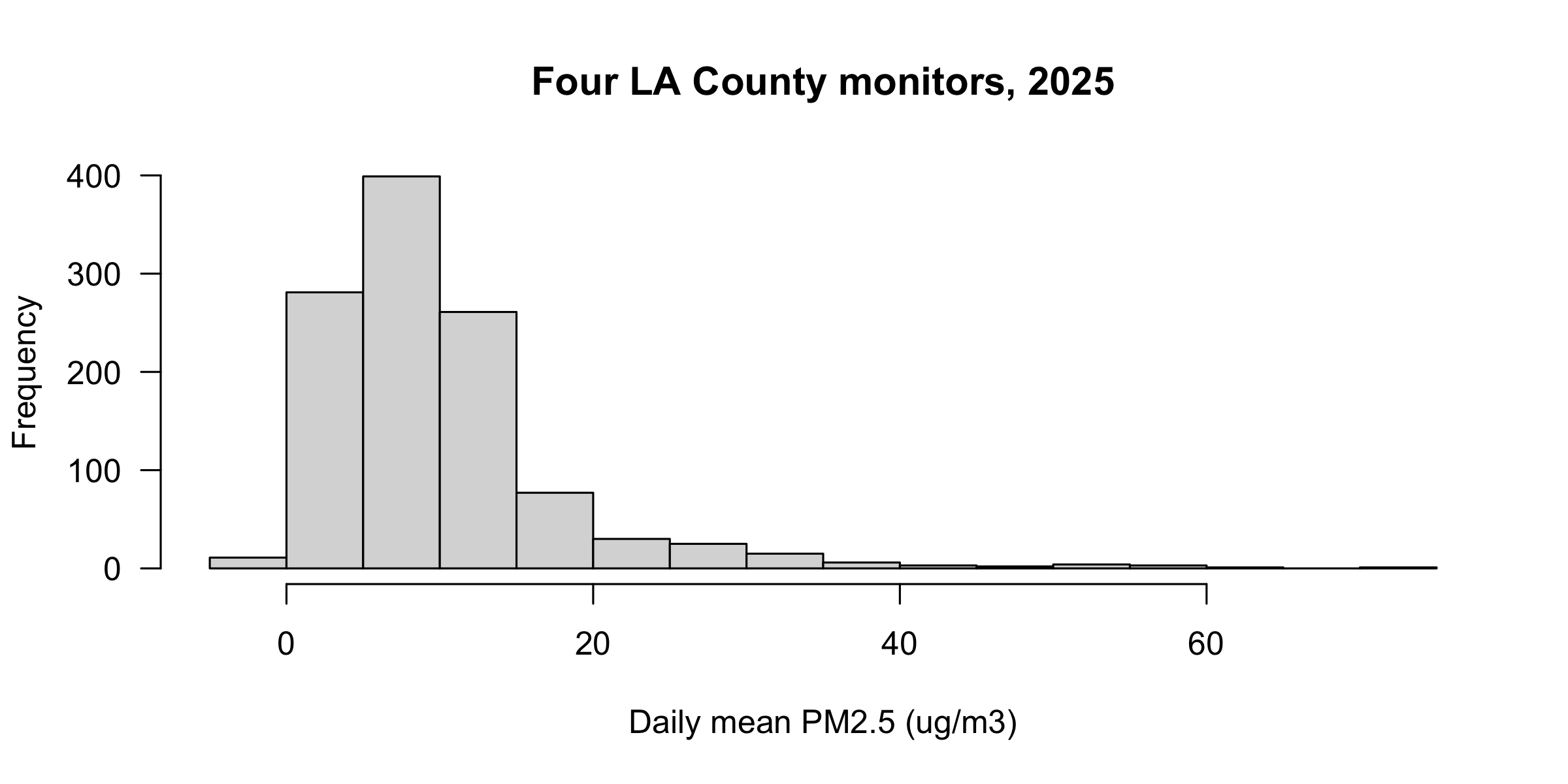
hist(d$pm25, col = "grey85", las = 1,
     main = "Four LA County monitors, 2025",
     xlab = "Daily mean PM2.5 (ug/m3)")
The four-station histogram with a grey fill, a written title, a labelled x axis, and horizontal y-axis numbers.

Layers: what draws on top

A plot is a stack. plot(), hist(), boxplot() and barplot() each start a new one. Everything else draws on top of what is already there, in the order you call it — so the last call wins where they overlap.

Layer What it adds
points(x, y) marks
lines(x, y) a joined line
abline(h =, v =) a horizontal or vertical reference line
text(x, y, "label") a label at data coordinates
legend("topright", ...) the key
axis(side, at =, labels =) an axis you write yourself
mtext("...", side =) text out in the margin, outside the frame

par(): the device, not the plot

par("mar")                       # 5.1 4.1 4.1 2.1 -- R's default
#> [1] 5.1 4.1 4.1 2.1
op <- par(mar = c(3, 3, 1, 1))   # set it, and keep the old value in op
par("mar")                       # 3 3 1 1 -- still, and for every plot after
#> [1] 3 3 1 1
par(op)                          # put it back

par() does not change this plot. It changes the device, and it stays changed until you change it back.

par(mar): giving labels room

op <- par(mar = c(4, 15, 1, 1))
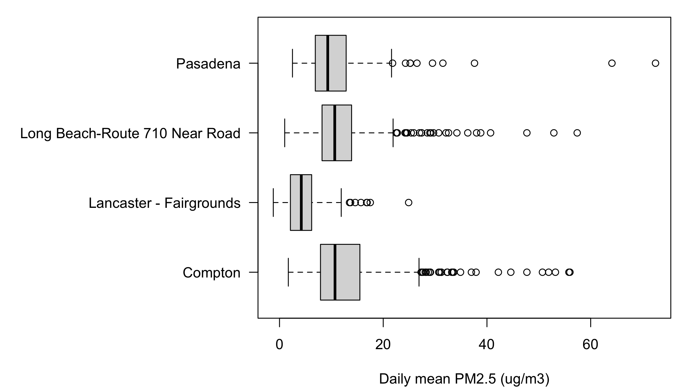
boxplot(pm25 ~ site, data = d, horizontal = TRUE, las = 1,
        xlab = "Daily mean PM2.5 (ug/m3)", ylab = "", col = "grey85")
par(op)
The four-station box plots turned on their side. All four station names, including Long Beach-Route 710 Near Road, are fully legible along the left. Lancaster's box is visibly lower and tighter than the other three.

par(mfrow) and par(mfcol): panels

mfrow fills across the rows. mfcol fills down the columns. Same grid, same size, different order — so the fourth plot you draw lands somewhere else.

mfrow = c(2, 3) mfcol = c(2, 3)
top row 1 · 2 · 3 1 · 3 · 5
bottom row 4 · 5 · 6 2 · 4 · 6

Four stations, four panels

op <- par(mfrow = c(2, 2), mar = c(3, 4, 2, 1), oma = c(0, 0, 3, 0))
invisible(lapply(transect, function(s) {
  x <- jan[jan$site == s, ]
  plot(x$date, x$pm25, type = "o", ylim = c(0, 75), xlim = xr, main = s,
       xlab = "", ylab = "PM2.5 (ug/m3)")
  abline(v = as.Date("2025-01-07"), col = "#b31b1b", lty = 2)
}))
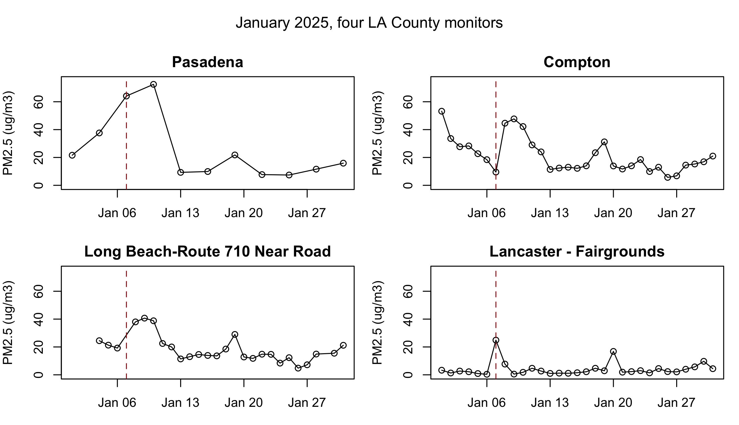
mtext("January 2025, four LA County monitors", outer = TRUE, line = 1)
par(op)
Four panels in a two-by-two grid, all on the same January window and the same 0 to 75 vertical scale, each showing one station, each with a dashed red line on January 7. Pasadena peaks highest at 72.5 on January 10; Compton and Long Beach peak lower and a day earlier; Lancaster is flat except for one spike on January 7. A single title runs across the top of all four.

png() and dev.off(): writing to disk

png("compton.png", width = 1600, height = 900, pointsize = 26)

plot(comp_y$date, comp_y$pm25, type = "l", col = "grey30",
     xlab = "", ylab = "Daily PM2.5 (ug/m3)")
abline(h = 35, col = "#b31b1b", lty = 2)

dev.off()                    # without this the file is unusable
#> quartz_off_screen 
#>                 2
file.exists("compton.png")
#> [1] TRUE

png() opens a file as the device. Nothing appears on screen until dev.off() closes it.

Forget dev.off() and the file is unusable — and your plots keep vanishing into it.

Resolution, bitmap, and vector

# One letter, three files. Nothing to load first.

png("letter-72.png", width = 200, height = 200)               # bitmap, 72 dpi
plot.new(); text(0.5, 0.5, "a", cex = 8); dev.off()
png("letter-300.png", width = 833, height = 833, res = 300)   # bitmap, 300 dpi
plot.new(); text(0.5, 0.5, "a", cex = 8); dev.off()
svg("letter.svg", width = 2.78, height = 2.78)                # vector, in inches
plot.new(); text(0.5, 0.5, "a", cex = 8); dev.off()
file.size(c("letter-72.png", "letter-300.png", "letter.svg"))
#> [1]  4358 24623  2686
  • Same 2.78-inch figure, three files. Open them and zoom in.
  • Bitmap (png, jpeg): pixels. res is pixels per inch; the default 72 is why figures go soft in Word.
  • Vector (svg, cairo_pdf): shapes, no resolution, sized in inches. Smallest file of the three.

The same letter, magnified

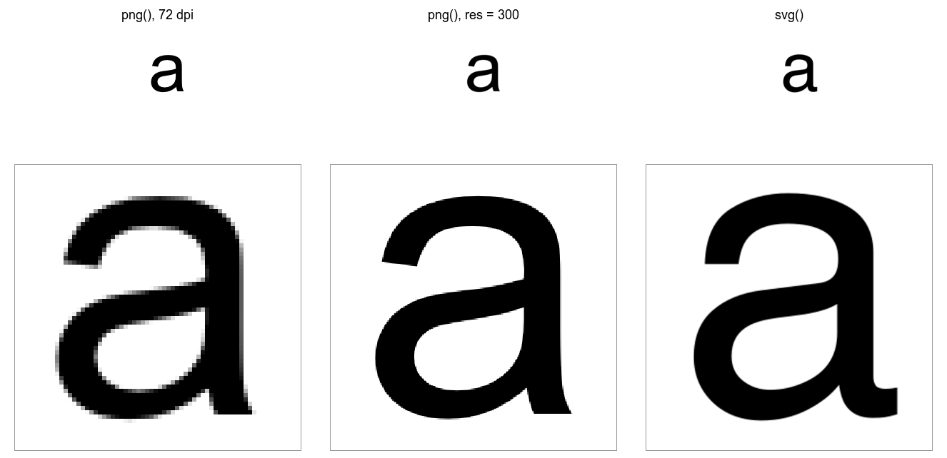
Two rows of three panels. Top: the letter a from each file at its own size, indistinguishable. Bottom: the same patch of each file magnified six times: a pixel staircase from the 72-dpi PNG, a smooth but faintly stepped edge from the 300-dpi PNG, and an exact curve from the SVG.

Top row: the three files at their own size. Bottom row: the same patch of each, magnified six times. The 72-dpi file is a staircase, the 300-dpi file is smooth until you look closer, and the vector file is the drawing itself at any zoom.

Exercise 2

# Four minutes.
#
# 1. Add ONE line above the four plot() calls so they fill a 2 x 2 grid.
# 2. Run it. Which station landed in the BOTTOM-LEFT panel?
# 3. Change ONE word in your line so that Pasadena lands TOP-RIGHT.
#
# Two answers to compare with the room: a station name, and one word.

# your line goes here

plot(comp$date, comp$pm25, type="l", lwd=2, ylim=c(0,75), xlim=xr, main="Compton")
plot(lb$date,   lb$pm25,   type="l", lwd=2, ylim=c(0,75), xlim=xr, main="Long Beach")
plot(pas$date,  pas$pm25,  type="l", lwd=2, ylim=c(0,75), xlim=xr, main="Pasadena")
plot(lanc$date, lanc$pm25, type="l", lwd=2, ylim=c(0,75), xlim=xr, main="Lancaster")

# put the device back
op <- par(mfrow = c(2, 2), mar = c(3, 4, 3, 1))
# ... the four plot() calls ...
par(op)
mfrow = c(2,2) mfcol = c(2,2)
top-left Compton Compton
top-right Long Beach Pasadena
bottom-left Pasadena Long Beach
bottom-right Lancaster Lancaster

Bottom-left is Pasadena. The one word is mfrowmfcol.

Practice

Fourteen exercises, with solutions, on the page and in the script.

  • 1 Choosing the plot: one function name per question.
  • 2–3 One series: Lancaster’s year; December with a reference line.
  • 4–6 Distributions: default bins, breaks =, one station against the pool.
  • 7–9 Groups and counts: box plots by station and month; sorted bars.
  • 10–11 Several series: a three-station January to replicate; line vs points.
  • 12–13 Panels and the canvas: a 2 × 2 grid; margins and mtext().
  • 14 To disk: the same figure as PNG and PDF, zoomed to 400%.

Quick reference

On the session page: the four plots, the arguments that port between them, the layers, the canvas, and writing to disk.